还是讨论 mobile web design 的话题,对之前的 Going Mobile 做些补充和修正。因为我的 blog 模板是完全用 HTML5 重写的,所有不支持 HTML5 以及 CSS 的移动设备浏览器全部忽略,我指的是此文只针对 iPhone Safari,Google Android Chrome Lite 以及 Opera Mini/Mobile 这些 Modern Browsers。
善用@Media 规则
Opera Mini/Mobile, Chrome Lite, iPhone Safari 都支持 @media 规则,所以下面这行代码基本上就能搞定这些主流的移动设备浏览器了。
@import url(css/handheld.css) only screen and (max-device-width:480px)如果你希望为 iPhone Safari/Chrome Lite 添加独立的样式表的话,加上 -webkit prefix 就可以了。
@import url(css/handheld_iphone.css) only screen and (-webkit-max-device-width:480px)Viewport 的重要性
由于 Opera Mobile 的默认 screen width 是 850px,而 iPhone Safari 则是 980px。如果你跟我一样,不设定 body 的宽度,而是让它自适应屏幕宽度的话,你会发现在移动浏览器上你的网页宽度可能远远超过了 480px。添加 viewport 的 META 到 HTML head 里能有效避免这个问题。
<meta name="viewport" content="width=device-width, initial-scale=1.0, maximum-scale=2.0, user-scalable=yes" />通过 width=device-width 将网页默认宽度设置为设备屏幕尺寸。
Float and Fixed Positioning
float 能不用尽量不用,但不等于说 float 就不能用,至少 iPhone Safari,Chrome Lite 以及 Opera Mini/Mobile 对浮动的处理都是很准确的。
真正需要避免的是 fixed 定位,一是浪费了原本就不大的屏幕空间,二是滚动页面时容易导致花屏。
使用 Max-Width
如果你的图片动辄 500px 的宽度,在移动设备的浏览器上显示肯定会溢出屏幕,最好的办法是给 img 加上 max-width 属性:
img { max-width:100%; height:auto; }充分利用好 HTML5 input
HTML5 为 input 加入了很多激动人心的新属性,包括新的 type,placeholder 以及 autofocus。
新的 Input 类别
新加入的 input type 包括 email, url, search…使用这些 type 准确定义你的输入框,不仅让代码更语义化,而且在 iPhone Safari 上也能获得更大的输入便捷。
例如,如果你的 input 定义为 email type:
<input type="email">在 iPhone Safari 上点击输入框,弹出的虚拟键盘是这样的:
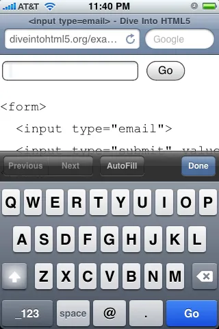
图片来自 Dive into HTML5: A Form of Madness
最下面的一排按钮包括了 email 地址常用的 @, . 符号。
而如果你的 input 定义为 url type 的话:
<input type="url">在 iPhone Safari 上弹出的虚拟键盘则自动包括了常用的 .,/,.com 符号。
图片来自 Dive into HTML5: A Form of Madness
长摁 .com 的话还能在 com, org, net 中切换,不得不赞叹 Apple 的工程师对 iPhone 的细节把握,可惜的是 Google Android 就没这么聪明了。
Placeholder 属性
placeholder 这个新加入的属性可以在 input 中加入提示性文字,当点击 input 时该提示性文字则自动隐藏。以往这样的功能是需要依赖于 javascript 才能实现的。
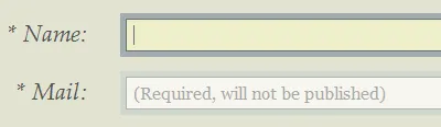
如上图,加入以下代码,在输入框内会出现_(Required, will not be published)_的提示性文字。
<input type="email" id="email" value="" placeholder="(Required, will not be published)" required />经测试,iPhone Safari 和 Chrome Lite 都支持该属性。
Autofocus
另一个新增加的 input 是 autofocus,目的是在页面加载完后自动聚焦到指定输入框内,这个效果经常在网页账号登陆页面上使用,例如 Gmail, Wordpress 的登陆页面等等。同样,iPhone Safari,Chrome Lite 以及 Opera Mobile 都支持它。
<input id="login" autofocus>No Font-Face
font-face 虽然在 iPhone Safari,Chrome Lite 以及 Opera Mobile 下都支持,但是以我的 blog 为例,即使开启了 gzip 压缩,一个 Graublau Web 字体还是有 38kb。最好还是为移动样式表重新定义下 font-family,去掉自定义字体。